Helm & Honey
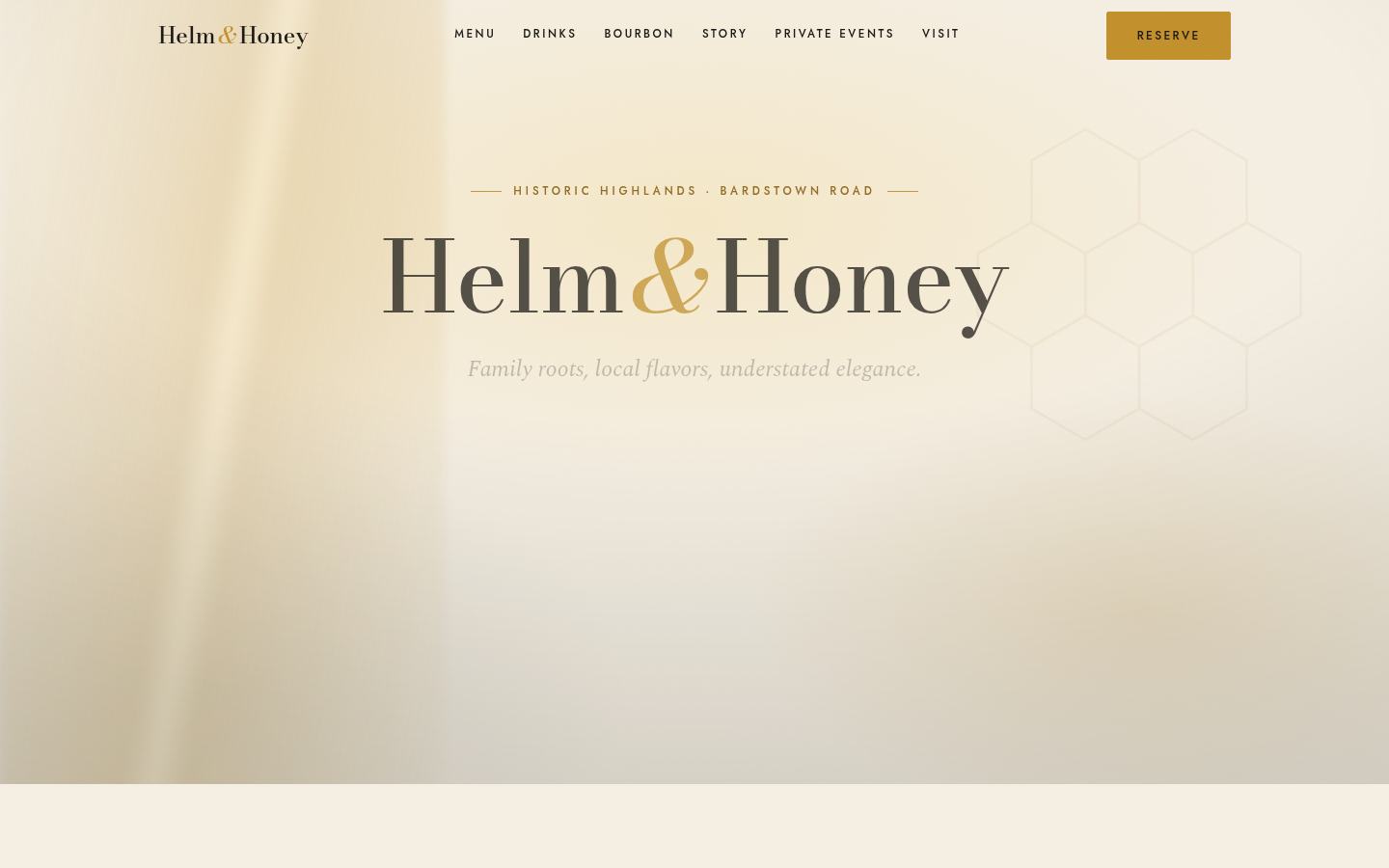
Understated, elegant site for a European bistro — menu, a curated bourbon library, and reservation booking.
Helm & Honey is a demonstration build we designed and produced in-house to show our approach for this kind of business. The demo runs live, but it is not an operating business site: ordering, booking, and checkout flows are for show, and nothing placed through them is fulfilled.
White-tablecloth restraint is the hardest register to hit on the web, where every pattern pushes toward louder. A European bistro with a serious bourbon program needs a site that whispers the way the room does, while still taking reservations and keeping two menus current. That tension was the brief for this concept.
We designed the site like a printed menu: quiet serif-led type, wide margins, and a slow, deliberate rhythm down the page. The bourbon library is presented as a curated collection with tasting notes, built to be browsed rather than scrolled past. Reservation booking sits inside the page flow instead of bouncing diners to a third-party widget on arrival.
The demonstration shows that editorial restraint and practical function can coexist. The menu and library patterns keep a changing cellar maintainable, and the booking flow captures intent without breaking the room's tone. It is the reference build we point to for upscale hospitality.
How We Built It.
Tone Study
Tone Study
Distilled the bistro's register into type, spacing, and pacing decisions before designing a single page.
Menu & Library Design
Menu & Library Design
Typeset the dinner menu like print and built the bourbon library as a browsable, curated collection with tasting notes.
Reservation Flow
Reservation Flow
Built booking into the page flow itself, keeping the diner inside the experience from first scroll to confirmed table.
Refinement & Deploy
Refinement & Deploy
Refined typography, spacing, and motion until nothing drew attention to itself, then deployed the demonstration live.